
#SWDChallenge – May 2021 – How we’ve grown

Introduction
Over the years and my various submissions in the Storytelling with Data community there have been a few versions of the challenge “take a viz and improve”. Usually, I have picked one of the first vizzes I have done or one that I wasn’t happy with after taking a second glance.
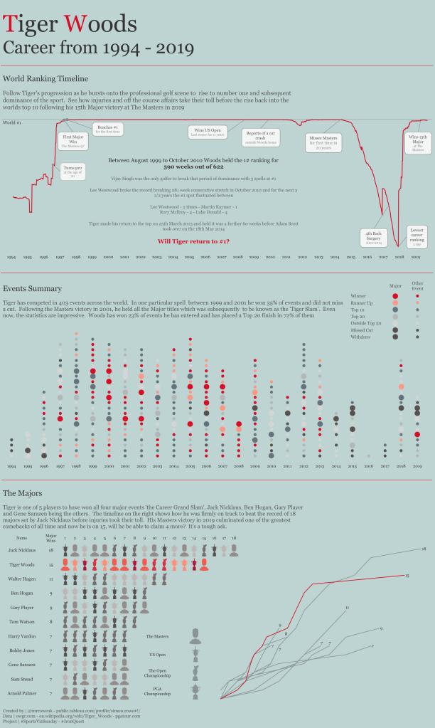
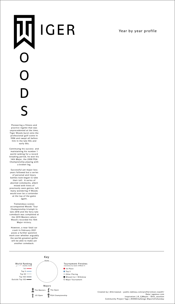
However, on this occasion, I took a different route. I picked a viz that I was extremely proud of, the Tiger Woods career profile (image on the Top Left). Back in 2019, I was completely blown away, when this was awarded Tableau’s Viz of the Day. I was also pretty surprised as whilst I had spent a lot of time and there were a few nice touches in my opinion it didn’t compare to the other amazing content that’s produced. A little bit of imposter syndrome definitely crept in.
The second reason for choosing the design that I did was that I recently gave one of Tableau’s new features, Map Layers, a go in producing a viz for #SportsVizSunday on the NCA Lacrosse Championships. I loved playing around with Map Layers, finding them really flexible and it was great to build up the viz all on one sheet. However, what pleased me most was the reaction that it received in the community which was really positive and I was particularly honoured to have got a couple of inspiration credits from a couple of the community that I have huge respect for, CJ Mayes and Mo Wootten.
If CJ and Mo did take any inspiration from what I did or wrote about, then I certainly took inspiration from what they produced. The vizzes below, using map layers techniques, completely, in my opinion, raised the bar on what I had produced before. I loved looking through both these vizzes, the imagination and design were first class.


So I began to think about how I could raise my small multiples map layers game and at the same time improve on a design that I was already really happy with. Quite a tough challenge, here’s what I did.
The Data
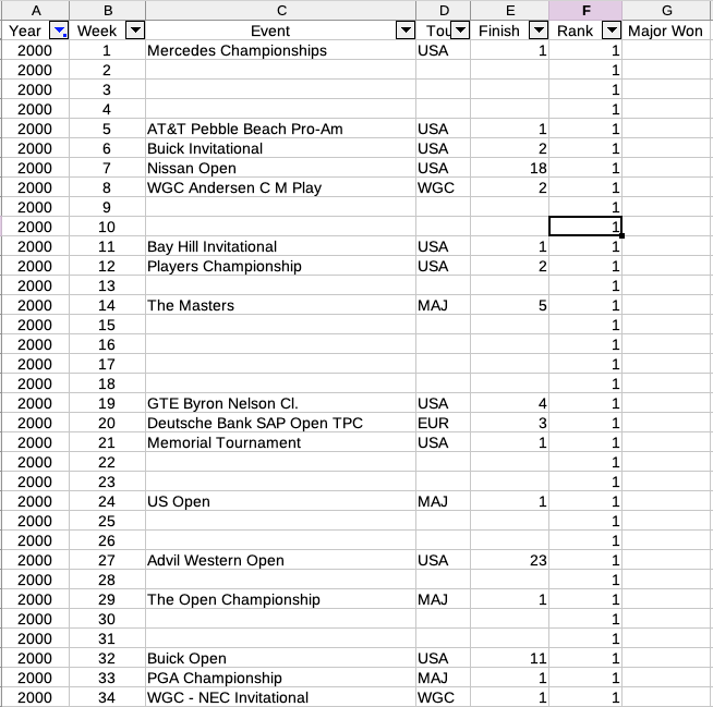
This was the easy part, because I already had most of the data I needed from the previous viz. There was a little updating to do, to get the final few tournaments Tiger played in but it was more about the structure.
I know I wanted the main element of the multiple to be a circle showing the weeks of the year and then some indication of whether Tiger had played a tournament and how well he had done in it.
What I decided to do was densify the data a little bit and for every year, create weeks (1-52) even if Tiger hadn’t played a tournament. Doing it this way was also to prove useful for the world ranking timeline (more on that later). So, my weeks data looked like this.
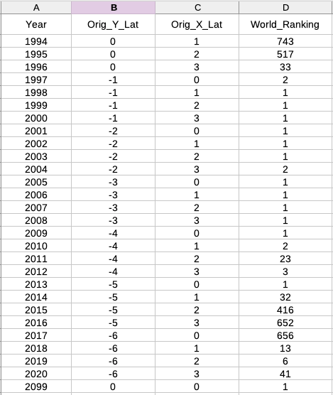
The year field was important, firstly, as that was the key denominator to breaking up the small multiples and secondly, it allowed me to join to a second data set (Years). The data set, was simply the layout coordinates for each year.
CJ, in his Champions League blog, mentions 3 techniques for laying out small multiples, do check all of them out! In the past I have used a calculation in Tableau to designate Rows and Columns based on the Index function and then using modulo and remainders to layout the multiples. For this particular viz I decided to use the same technique that CJ used and build into the data an X and Y Base position.
My preference? I certainly found setting up the base X and Y had it’s advantages as it could then be used as a static placeholder to create all of the other other map layers from. The Rows/Columns calculation has only one job but maybe it’s slightly more dynamic, a couple of times I wasn’t happy with the layout so I had to change my data around a bit and refresh. Ultimately, both ways get the same result so it’s probably down to personal preference and what the overall intention is. When that was done, my Year dataset looked like this. Hardly ground breaking stuff and I didn’t even use the World Ranking column in the end but I thought I’d leave it in so you can gain a bit of Tiger knowledge! Finally, spot the deliberate mistake in columns B and C. That’s the price you pay for copying and pasting. Again, no impact though, just concentrate on Y & X and forget the fact they both say Lat!
In Tableau, I joined these together, joining on Year to create my final datasource. Looking at it know, I’m quite pleased how I’ve been able to create something I’m really happy with with so little data.
The Design
Firstly, the easiest one, just to check I was quite happy with the layout, I created a [Base | MP] calculated field. Dragging that onto the view gave me something that looked that this.

The next was the outline, circle. I had experimented with different colours, opacities on this but in the end went with a simple light grey. Because I had a data point for every week all I needed to do was draw a circle with each of those points and switch the mark type to polygon to fill the circle in.
I’m no Triganomitory expert by any means. Pretty much all of my limited Tableau circular knowledge has come from Ken Flerage, check out these amazing blog posts for an explanation far better than I could come up with and also Toan Hong, if you haven’t signed up to his fantastic Udemy courses then I’d strongly encourage you to do so. They have opened up so many ideas and possibilities to me. I cannot emphasis enough that to get to the next level of Tableau, knowledge around these techniques are essential even if you aren’t going to use them for specific charts.
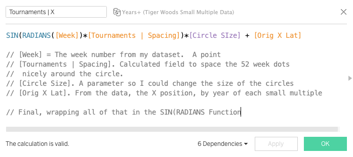
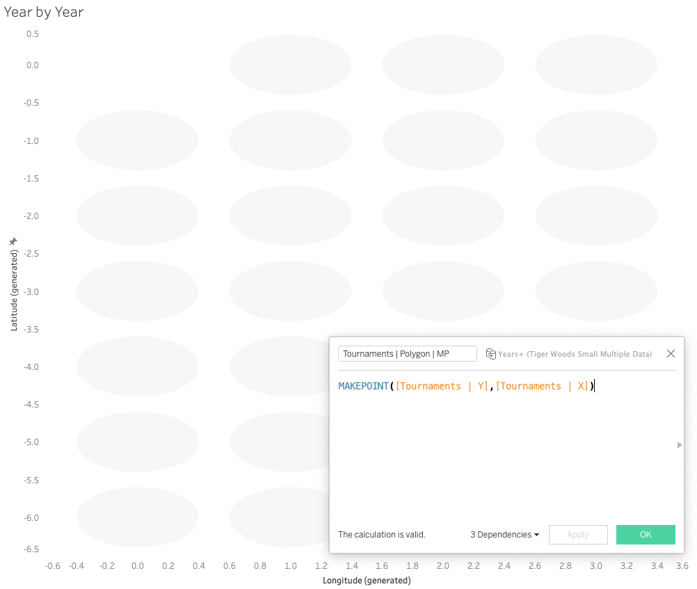
Below are the two X and Y calculations I used for my circle, explanations of the fields are in the calculations

Then, simply using the MAKEPOINT function and passing these two through, setting the Mark Type to Polygon and finally, adding [Year] and [Week] to detail, to allocate the week points and years correctly across the view gave me this.
Don’t worry about the fact the circles are squashed, that’s simply the size of the worksheets. They really are circles, promise.
I created, a small border to the polygon, using an exact duplicate calculation and only changing the Mark Type to Line instead of polygon. Again, I played around quite a bit with this to try and get a look I wanted.
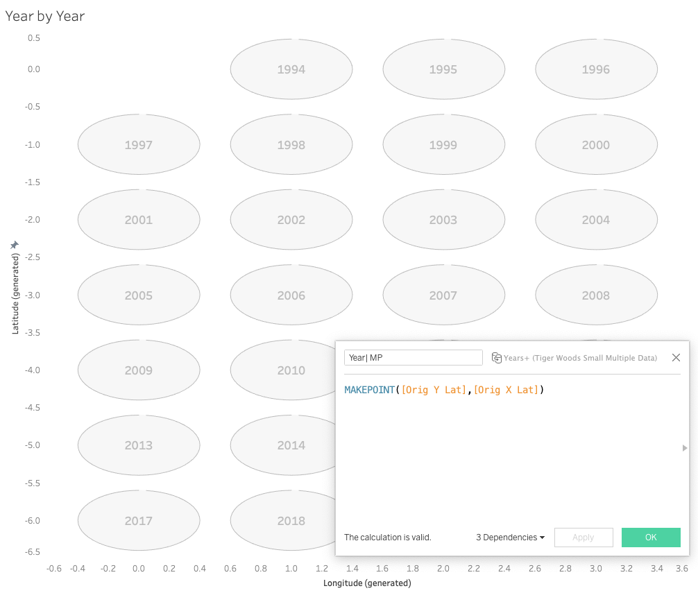
Next, another easy one. Adding the year was a simple MAKEPOINT just using the original Base X & Y fields in my data. This was definitely one of the advantages of using this approach. Then, it was a case of adding Year to Text and changing the Mark Type to Text. This is how it now looks.
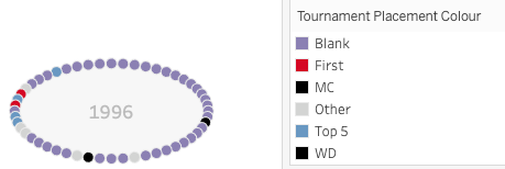
It does get slightly more complicated, but not much, one of the reasons I really enjoy working with Map Layers. Onto the individual tournaments next. Again, pretty easy from a calculation perspective, I already had the calculation I needed, the ones which drew the polygon so all I needed to do was create the appropriate MAKEPOINT and ensure when I added the marks that I hid the points for the weeks that Tiger didn’t play. To give a visual idea, here is a before and after of all the dots versus hiding the Null value ones.

The final point here, is the Mark Type, following a tip from Simon Beaumont on VizConnect, he suggested that when doing circular dots it’s best to use the Pie Chart mark type rather than circle. It definitely does sharpen up the dots so it’s a tip I’d recommend.
Another easy one next, adding a small white dots in the tournaments to indicate whether the event was a Major Championship. I did a calculated field with a case statement on the event and returned the event name if it was a major championship and NULL if not. Then using that same circular X & Y put these on as small white dots, just a slightly small Pie than the Tournament ones. This is how the design looks now.

Getting there, but two finishing touches needed. Firstly, I wanted to show the Majors as something special. I decided to do this by getting an image of the trophy and placing it in the circle. The calculations here were a bit hacky to be honest but as I knew this was a one off it wasn’t too much of a problem. Ultimately, based on the combination of Majors Tiger won each year I hardcoded a fixed position for where the trophy should go. Again, all based on the original X & Y co-ordinates it was a case of shifting up, down, left and right a little bit to get what I needed. The mark itself was shape and I already had the trophy shapes in my repository from the previous viz.

Finally, and if you’re still reading, my favourite layer and one I’m most pleased with, the week by week ranking line. Again, no problem with the data, I had each week and the ranking Tiger was at for that week. So to do a simple line chart of that would have been easy. The main complication was that I had to refine my weeks (1-52) into a smaller space and the same with the Y (Ranking) axis, this went from 1 to 1,199 so again, I needed to squash that down.
For the weeks, I worked out that if circle diameter was 0.8 and went from (-0.4 to 0.4) then the range I was actually working with was somewhere in between that. In the end I settled on the line going from -0.2 to 0.2. Then, all I needed to do was get 52 points (weeks) fitted nicely within a range of 0.4 (-0.2 to 0.2). Calculating this gave me a week by week gap of around 0.007 and I just needed to add that amount on to each week, starting from a base of -.20 to give me 52 weeks from -.20 to .20.
I did the same with the Ranking, working out the total size I wanted to fill and then how much each individual ranking change would take up, in this case a very small 0.000125. Putting both those within the MAKEPOINT function, applying some categorical colours and using the Line Mark Type gave me the final Map Layer.
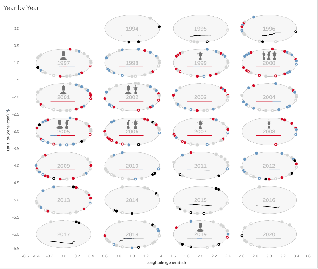
So, that was the final layer and the almost the end of what I needed to do in Tableau. The final part was creating a dummy year 2099 in the data and adding dummy records to it in a nice place to make a key. Then, a duplicated worksheet and filter later I had the basis of a key.
For the final part of the design I moved over to Figma to create the main background image and also the additional elements of the key. Thanks again to CJ who was too kind to give any criticism but did pose a couple of questions that made me rethink how to layout the key in a slightly better way. The final background design is below.
Summary
So, have I “grown”? When I look at the two images, I can say a few things with a certain degree of confidence.
- Technically, this design was more complicated than the original with the use of Map Layers and some other Tableau tricks and tips that I have learnt along the way.
- Comparing the two, purely on an design basis, I much prefer this version, it’s one of the few designs that I’ve done where I look at it and think “this might have been done by someone else”. Back to the imposter syndrome, I pretty much always think my designs always lack something when I compare with the other wonderful submissions by the rest of the community.
BUT
Purely on content, I think the original takes this prize. There is a lot more detail here with narratives around the ranking and descriptions of all the graphs.
Ultimately, I guess it depends on your preference of visual appeal versus a more descriptive content but back to the original question, I would never have been able to produce this a couple of years ago, so yes, I have grown.
As always, thanks for reading, any questions or comments, please let me know.
Simon
