
#SportsVizSunday – April 2021
An adventure into Map Layers in Tableau

Introduction
After tackling Adaptive Sports in the last #SportsVizSunday I decided to give another topic I knew very little about, Lacrosse, a go in the latest challenge. Whilst I find it easier to viz about subject I know very well and have a keen interest in I also think it’s really important to dive into unfamiliar topics from time to time to 1) evolve the skill of analysing data that you might not be familiar with and 2) learning something new. I certainly know more about Lacrosse now than I did a week ago!
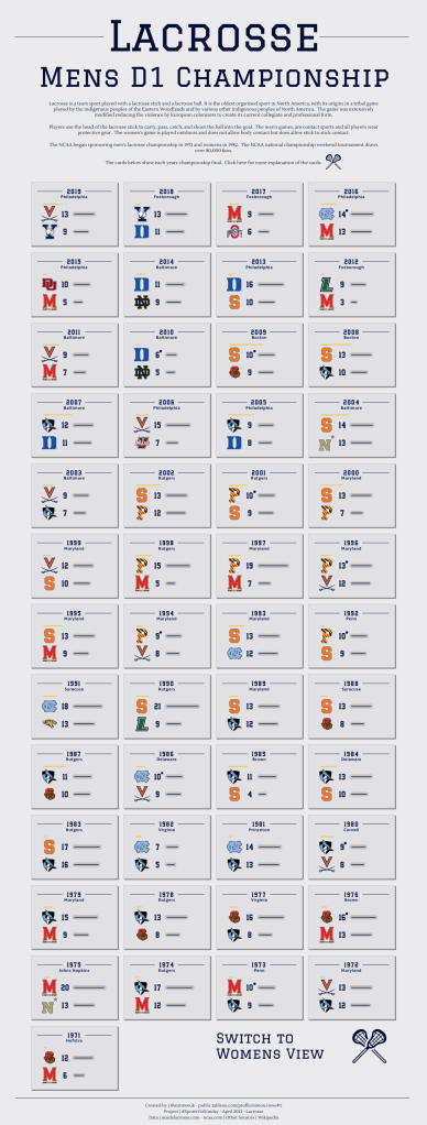
As with most of my designs I tried to give a bit of thought to what the layout might be. Looking through the data provided, I liked the idea of plotting the various championships over the years. I thought about visualising most successful teams, longest winning streaks, longest time between championships and elements like that. But in the end, I decided to go with the small multiple (cards) approach with a consistent card for each championship final with the user being able to scan through the years. It was also important for me to be able to include the women’s game as well as the mens.
As I was playing with initial ideas of how to set up the cards I began with a trick I had used before for #SportsVizSunday (Google Trends). This works well and gives a lot of control but does get a bit fiddly lining up all the different sheets on top of each other in a dashboard.
So my thoughts turned to Map Layers. I recent feature in Tableau 2020.4 and one which I had seen a few Blog tutorials on and more recently a really innovative viz on FIFA 21 Players by CJ Mayes.
I did a bit of research and came across these three blogs which I used for my inspiration and learning.
- Adam Mcann – Dueling Data: Layers in Tableau 2020.4
- Luke Stanke – Beyond Dual Axis: How to Use Map Layers in Tableau 2020.4 to Build Next-Level Visualizations
- Jeffrey Shaffer – Layering Mark Types in Tableau 2020.4
They were all incredibly useful and I picked up a pretty decent understanding of how to get going from reading them.
Map Layers
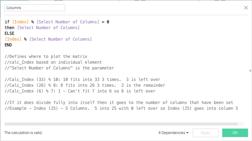
Firstly, I had to create my small multiples. There are a few ways I have seen this done but they all revolve around creating a [column] and a [rows] field and placing them on the view. The way they are calculated drives the small multiple or panel layout. My calculations are below using a calculated field called [Index] and a Parameter called [Select Number of Columns]

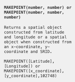
This gave the basic structure that I could then apply the map layers to. The first principle with Map Layers is the Makepoint() function. Essentially, this is a geographical field using a X and Y co-ordinate. The full description is here
I decided that I wanted a grid for each of my small multiples to go from -15 to 15 on the X Axis and 0 to 20 on the Y Axis. I wanted a 0 point in the middle of the X Axis and then wanted to have a 3:4 ratio for the grids. I guess I could have gone -10 to 10 on the Y Axis.
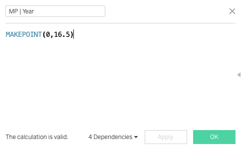
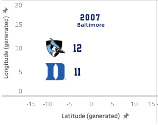
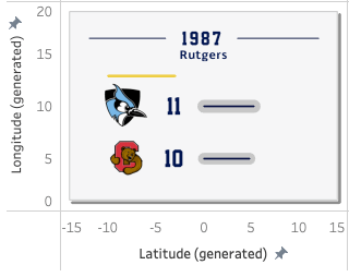
The first Map Layer was an easy one. I wanted to put the year of the final onto the top of each card and in the middle so I created a calculated field called [MP | Year]. This was simply putting the first argument as 0 (in the middle of my -15 to 15 axis) and the second argument as 16.5 (pretty near the top of my 0 to 20 Y Axis)
Then dragging this field onto the view automatically creates a Latitude and Longitude field. Placing Year on Shape allowed me to create an individual image for each year and use a custom font. I also took the opportunity to fix the X (Latitude) and Y (Longitude) Axis to the dimensions I mentioned above. At the end of this first stage I had something like this.

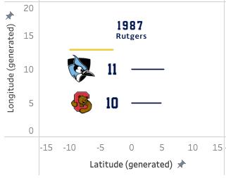
I repeated this process using simple MakePoint calculated fields to create placeholders for the following items
- Venue
- Winning Score Label
- Runner Up Score Label
- Winner Badge
- Runner Up Badge
This got me to a card which looked something like this
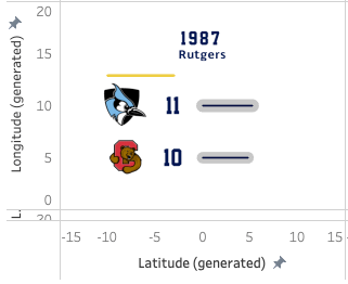
It was taking shape nicely but I wanted to show visually, the difference between the two teams. My idea was to create two horizontal bars next to the scores which indicated the scores.
There were a few parts to this. Firstly, as my axis was up to 15 I needed some kind of normalisation as in some cases the winning score was more than 15. In addition, I only wanted for the maximum length bar to go up to 10 on the X Axis to give a bit of breathing room for each card.
To achieve this I first created a LOD calculation which gave the maximum winning score for each gender (as I was creating a separate view for Men and Women).

Then, using this maximum score I was able to take each individual winning score and by dividing that by the maximum score gave me a normalised number between 0 and 1 and then all multiplied by 10 to use the full range I was looking for. In an example, if the maximum winning score for men was 21 and the winning score of a particular year was 15. 15 / 21 = 07.14 multiplied by 10 = 7.14 which is where the end point of the bar would be.
Next, I needed a starting point for the line. All I had at the moment was the end point (the winning or runner up score). To do this I simply added another copy of the data with a union join which gave we two points now. Finally, I brought it all together in the calculated field below.

This gave me the path, now all I needed was to use the MakePoint function to place it on my view. Again, 10 is just a manual reference to being in the middle of my 0 to 20 Y Axis.

I did the same with the Runner Up score and this gave me the following. You can see how 12-11 draws the bars very close to each other but quite a long way back from the maximum possible value, 10. This is because 12 as a winning score is a fair way from the maximum score across the whole view, which is 21 in 1990.

The other line I wanted to draw was an indicator of how successful the team had been by showing the number of championships they had one as the years progressed. What I wanted here was a line just above the winners badge that showed the cumulative championships. To create this I used my recently densified data to give me 2 points, the first I set to -10 (the position on the X Axis where I wanted the line to begin) and the second was simply the cumulative number of championships (I had added this to the dataset so it was available as a field).

As per previous steps, the final part was to create a calculated field using MakePoint() to set my points. Again, the manual 12.9 referred to how high I wanted the bar to be on the card. This took a bit of trial and error to get exactly where I wanted it.

As an aside, when adding each of these calculated MakePoint fields as a new MapLayer I had to also include the correct fields to ensure the information spread over the small multiples correctly. This included adding the [Year] field to the detail shelf and also changing my Row and Column Table Calculations to incorporate the respective new information. At this stage my small multiples looked like this.
At this stage I was quite happy with what I’d done but wanted to make it look a little nicer. Usually, in these situation I would go for a background image using something like Figma to create some nice shapes underneath or shadows. However, on this occasions I wanted to see whether something would be possible using Map Layers.
Firstly, I wanted to create a little focus on the score bars. This was easy enough, essentially I created a duplicate series of calculations for the Winner and Runner Up bars and placed them onto the view. Expanding the size of the lines and changing the colour gave this effect.
Onto the final stage, I wanted each of the cards to have their own backgrounds and some kind of border or drop shadow. To get started I created a simple sheet in Excel in which I created a path outline which followed my -15 to 15 and 0 to 20 Axis but taking a point off of each.

I brought this into my Workbook and joined it to my main data using a relationship and using a many to many join (1 to 1). This gave me access to a path to begin creating some backgrounds. Firstly, I created an overall background shape. To do this, I created a MakePoint calculated field and in the arguments placed the [X] and [Y] fields from my sheet above. Placing this as an additional Map Layer and ensuring that I had placed the [Path] field onto the Path shelf and setting the mark type to Polygon gave me this.

At this stage I probably got a little carried away, I wanted to see what else I could do. I decided to try and create a drop shadow using a similar technique to the background but just changing the path slightly and of course the X and Y placements to offset slightly from the main background.

Using these X and Y fields in my MakePoint function gave me the following

Just one final, final touch! A very small cosmetic line on either side of the year. Using identical techniques to the score and cumulative championship bars I used the two different tables to create two dots and joined them together using some trial and error on where they should be placed onto the card. My cards were finished!
All I needed to do now was a bit of tidying up, removing the headers obviously and then creating the dashboards. Because the Mens and Women’s games had started at different years I decided to create two operate dashboards and then a navigation between the two. I also added a information hidden container so the user could see the details that each card contained and finally, I did use Figma to create a background image using fonts that I thought gave a college, USA, sports type of feel. NOTE – I had a bit of trouble with my background images as while they looked great in my own Tableau they didn’t render when published to Server. It took a lot of trial and error to work out that it was the name I had given the image which caused it to fail. Lesson learned – Don’t use special characters when naming background images. I had called mine “M | Background”
Summary
Initially, when I saw Map Layers as a feature I couldn’t really see how they could be useful other than a bit of a gimmick and potentially an excuse to add more than is necessary to a view. I have to say, after the the great work of those I have referenced above and having explored in more detail I am converted! The possibilities are pretty much endless. The first thing I would say to anyone who asks is to remove “Map” from the conversation, just think of it as additional layers and it will open up a whole new world.
I really enjoyed putting this together and as always, extended gratitude to the #SportsVizSunday team for providing such an excellent platform.
The final viz is here. Please feel free to download and have a play if any of the ramblings above didn’t make sense!
Thank you for reading, I hope it was useful and please let me know if you have any questions.
Simon

4 thoughts on “Lacrosse D1 Championships”