
#IronQuest August 2021 – Vacations and Trips
Introduction
The moment I saw the title of the latest #IronQuest I knew I wanted to do something based around the unbelievable experience I had back in 2004 when my wife & I spent three months travelling around the United States of America. Because I had been thinking about doing something on this trip pretty much since I started doing visualisations with Tableau I put a bit of pressure on myself to do the best I possibly could on this one.
I was really pleased with the response I got and it was really interesting to see that a lot of the feedback was focussed around the personal elements that I had added in. More often than not my vizzes are factual and don’t really have that personal touch. It was really nice to read those comments.
I also had some positive comments around the technical elements and was pretty pleased when Danny Bradley mentioned he had used it in a session he had ran with his team.
And finally, I was pretty elated when Tableau chose this as ‘Viz of the Day’. As with the previous 2 designs that have won this with I was both surprised, proud and extremely pleased all at once when this came through.
The Data
Probably because of the type of person I am and my interest with data, I had some pretty good detail of our trip, even 17 years on. Looking back through old computer files I had a record of every nights stop location, which city/town, which hotel and the date. In addition I had also recorded, for each trip, how many miles it had taken to get there.
The final part and probably the most enjoyable was that my wife and I kept a small diary after each day of our trip. It was so much fun to read through these and relive the memories of the trip. It also came in handy when I was tracking the route just to check I was on the correct path. Bringing this all together I had two datasets
- Travel – The route for each day. How many nights I stayed in the locations, where we were travelling from and to, if it was a hotel element, the name of the hotel.
I had explored quickly just plotting straight lines between the locations, for example, one line between Seattle and Portland. Of course this would have been easier, just looking up 59 separate Latitude and Longitude elements or even easier using Tableau locations data to match the city town locations. However, after a quick test building up the map this quite frankly, looked rubbish and gave no indication that this was an exploratory road trip at all.
So I turned to a website that I have used previously to create the map polygons for my Great Fire of London Viz and also the Wheelchair London Marathon one.
The website is called headwallphotonics and allows points to be drawn on a map and returns a series of Lat and Long coordinates. In the example below, I’ve started in Seattle (47.57579015156517, -122.3394732108621) and continued all the way to Portland with each dot (a click I’ve made) registering a new line of Lat and Long coordinates.

So, yes, this did take a long time to do it for 90 days worth of journeys and ended up creating over 1,700 rows of data but for me it was more than worth it 1) because it achieved the look I was going for and 2) as I mentioned above, it allowed me to look through our diaries and relive the trip and routes all over again.
The second element of my data was altogether more simple
- Miles – For each day the number of miles we travelled and how many nights we were staying from that particular days travel. I added this so I could see if we were doing longer drives before longer stopovers.
Data done, onto the design!
The Design
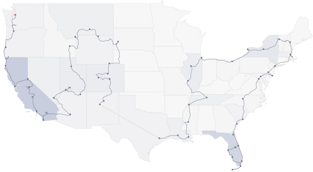
Map Section
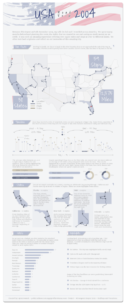
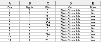
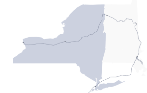
The first part of the design was pretty straightforward I wanted a map of the USA with the route that I took. To do this I used 4 separate Map Layers. The first, was to give a slight shading of each state that we stayed in. The Map Layer for this was “Map” and with the [State From] field on detail and the number of nights on colour. I had one small issue however, as I wanted to use a pretty minimalistic map I had turned off pretty much all the various map options in Tableau. This left me with a map looking like this, only colouring in the states where I had actually been. That’s pretty obvious really as I didn’t have any data for the states I hadn’t been too.
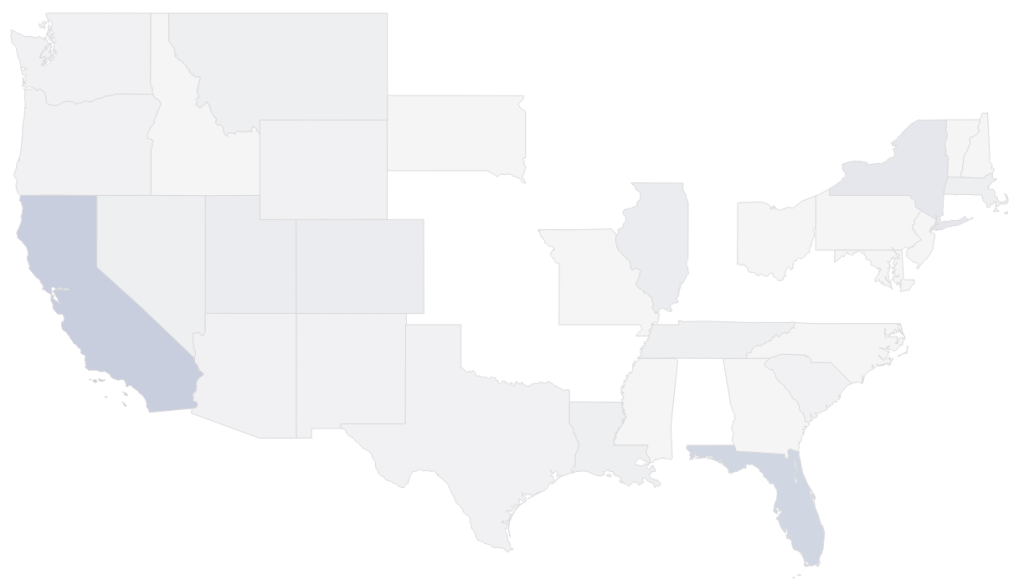
My solution here was just to add a simple one line entry for each of the missing states with a Lat and Long reference right in the middle. Now I had a complete map.
The second map layer was the route itself. The only differentiator here was I wanted to use a different colour for the different methods of transport as whilst most where driven we did catch a plane and a couple of trains along the way. Adding this on as the next layer gave me.
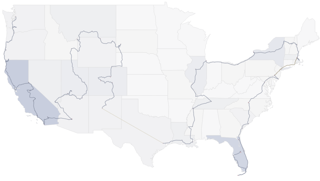
The next map layer was just to add dots in the locations that we had stayed together with a final layer which highlighted the first and last stop on our journey. Once placed on, the final map looks like this.
Timeline Section
The next part of the design focussed on a timeline of each day and how many miles were covered together with some extra charts looking at how many miles were covered in the West and East sides and split by the number of days we were staying in each location. The charts themselves were quite simple. The timeline is a dual axis chart with one axis displaying the number of miles as a bar chart and the second as a circle (which sits on top of the bar). The colour of the dot represented how many nights we would be spending after that particular journey.
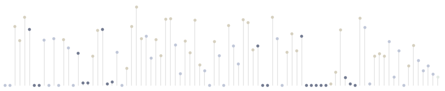
The rounded bar charts were created by using a line type and drawing the line between two points (as measure values) 0 and the ultimate end of the bar, the average number of miles by night spent or location (West or East). Adding [Measure names] to the path draws a straight line between the 0 and the end points. And making the line bigger gives it that rounded look.
The final chart in this section was a doughnut chart. To create this is again using a dual axis with the first being a Pie chart with the colours and angles set in this axis and a second axis added which is slighter smaller than the first and all of the detail removed so it looks like there is a hole.

States Section
Alongside the main map, this is probably my favourite section in the viz. To create it was actually very straightforward. I selected the 5 states, based on the number of nights we had stayed there and then take a copy of the main map worksheet for each of the 5 states and simply filtered the target state. There were a couple of states where I went in and out of the states so to keep the route line together I needed to include in my filter the states that I passed through. To then hide these states I made them the same as the background colour of the viz to make them disappear. Here is an example of New York where you can see the states of Massachusetts, New Hampshire and Vermont in the background.
From there I added a few personal highlights of that state which was a bit of struggle to right the correct amount of words to fit nicely into the space.
Hotels and Highlights
The hotels I stayed in was a similar rounded bar chart to the ones in the Timeline section. I wanted to show the array of different chains we had stayed in together with a few independent hotels and motels as well.
And finally, the highlights section. In a way this was a little bit of an afterthought, I had intended to do something, more infographic style, where these snippets were dotted around the viz but with my limited creative skills I decided that probably the best way to go was to have a separate dedicated section. I had no trouble filling it up with little snippets of information about the journey, especially those bits which would seem very strange in todays mobile and accessible world. The final part was some headlines of the day which we had found interesting or enjoyed watching during our trip.
The Background
As with most of my larger designs, I have a background element underneath the Tableau parts which gives me more variety and flexibility with the design, fonts and general layout. My tool of choice is Figma and as well as it being free (for a slightly more limited version) I find it incredibly easy and intuitive to pick up. No doubt there is also a pretty good learning curve too and you only need to look at the work of Lindsay Betzendahl to see how powerful it is.
I settled on 2 fonts, Shadows into Light for the headings and Metamorphous for the main text. The main blue colour was linked to the main USA flag at the top and then I used colour palette generator Adobe Color Wheel to work off of this blue and provide some complimentary colours like the browns. Adding a few labels and arrows to provide legends and keys gave me the background below.
Then it was a simple case of adding this to the Tableau Dashboard, getting the size correct, placing it at the back and adding the tableau worksheet elements on top. Of course, this was very iterative and there was a lot of back and forth, tweaking sizes, placements to make sure I had the look I wanted.
Summary
I’m so pleased that I got a chance to create a viz on one of the best times of my life and the platform that #IronQuest provides to do this. To receive the feedback I did and the Viz of the Day accolade is just the icing on the cake because I had already loved putting this together.
As always, thanks for reading, any questions or comments, please let me know.
Simon

One thought on “USA Road Trip 2004”