
#SWDChallenge – March 2021 – MAPness

This months #SWDChallenge had one simple requirement, to make a design which included a map. Just last month I had published a viz of the Great Fire of London using maps so I was already in the “map zone”. As usual the first thing I needed to do was think of an idea. 2 options quickly came to mind, firstly, something around Phileas Fog’s 80 days around the world and secondly, a plot of the tallest buildings or tallest cities.
After researching on the internet, I found a really good resource SkyscraperCentre.com which had loads of information and facts so I went ahead with my second option.
Continue to read on or jump to a specific section if it’s more appealing.
- The Data
- Designing the background
- Building the maps
- Creating the Tableau Workbook
- Conclusions…and disappointments
The Data
After looking through what the website had to offer, I decided to create two map views. The first, main map which had the top 20 cities based on the number of tall buildings they had and the second, a pop out view which showed the top 10 buildings in that city. I choose to limit at these numbers because I had a manual task ahead of me.
The first data was simple. The Top 20 cities contained details around the population, density, area and of course the number of tall buildings each had.
The second was more interesting, for each of the 20 cities I wanted to plot their top 10 buildings and for that I needed each of their Latitude and Longitude details. Luckily the Skyscraper site had each building listed and then a useful section which had the address which clicked into a map.
Then I used the super useful resource that I had used to draw previously to find the corresponding map. Then I simply clicked the point and collected the Lat and Long details. Whilst this was very manual (around 4 hours to collect all 200) it was quite interesting exploring each of the cities.
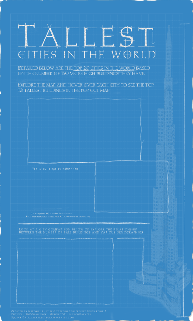
Designing the Background
Pretty much everything I do in Tableau now has a background layer underneath. My tools of choice, Figma and Pixelmator Pro and used interchangeably and often based on how much playing around I want to do. For this I went with Pixelmator Pro.
Very quickly I had decided to have a blueprint style background and after a bit of research, decided to create my own. This was quite straightforward by filling the background with blue, adding a layer of “noise” to create a grain effect and then creating a series of lines criss-crossing the blueprint. The biggest challenge was working out how much to fade them to make them visible but not over power the main design. This was very much trial and error with colours, opacities and sizes.
Next, I did a small amount of fraying of the paper around the edges, just to give it a bit of a worn feel.
The main font I used I found by searching for architectural fonts was called CRAFTED and I also used another one which I wanted to look more handwritten, called CHALKBOARD this was used for some of the legends and also the comparison selections.
Because I wanted to create an effect of this being actually drawn I added some chalk effects including a few indeterminate smudges, crossings out and underlines. Originally I had a lot more but it seemed a bit busy by the end so I removed a lot of them. I also drew some chalk borders around the maps as they tend to end a bit abruptly in Tableau.
Finally, I added a shadowy Burj Khalifa. I think it looks a bit like a watermark but other than that I just liked it, and of course, it is currently the world’s tallest building. Below is the final background.
Building the maps
As I did last month for the Great Fire of London, I reference the excellent the two excellent resources for Mapbox that I use regularly.
I created two slightly different Map styles. The main cities one was a very plain map with minimal features, ensuring the colours were consistent with the chalky effect of the background.
The second map was a little more detailed, as it was a city specific view I added road detail and also water detail to bring out any city rivers that would help the viewer get their bearings.
Creating the Tableau Workbook
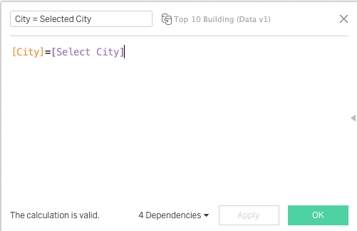
With the background and map designs done the last part was to bring it, and link it, all together in Tableau. The first part was to create two parameters. [Select City] and [Comparison], I’ll reference these later.
The main map view was very simple, placing the [Long] and [Lat] fields on Columns and Rows and [City] on detail, gave me a point for each of the 20 cities. With size on [Total number of tall buildings] and a bit of formatting for the dots to work alongside the map layer it was done.
The second “pop out” map was very similar. Using the City dataset again I placed the [Long] and [Lat] fields on Columns and Rows and put [Building] on detail. I created a ranking of the buildings by using Index.
The final part was to ensure that only the selected cities building were selected and therefore shown on the map. For this I created a calculated field called [City = Selected City] and filtered this to True.
Whilst the City map view was interesting I wanted to compliment that with a simple bar chart showing the Top 10 buildings. I went with a rounded bar chart view as it was slightly softer and again, ensured my [City = Selected City] was set to True. The trick with a rounded bar chart is to create two measures, the first being the actual end value and the second a hardcoded zero. Then with those two measures on the view, joining them together with a line type creates the rounded effect. There is an excellent tutorial here by Andy Kriebel.
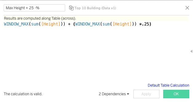
The second trick was to ensure my labels would fit on the chart at the end of the bars. To do this, I created a calculated field called [Max Height + 25 -%] which takes the height of the tallest building and adds on 25%. Then I placed this field on the view as a reference line. Hiding the reference line formatting creates space at the end of the chart to ensure labels are shown.
The final part was to create a Dashboard Parameter Action to change the value of [Select City] when a City dot on the main map was hovered over. This controlled the pop out map and also the Top 10 buildings chart.
The section at the bottom I wanted to have a range of chart available to the viewer to see an overall city comparison and then 3 scatter plots showing the comparison between the number of tall buildings each city had compared with their populations, densities and areas. I didn’t want all four on the viz at the same time so went with the sheet swapping option. The main principles behind this are
- A parameter (and parameter action) to control what’s been selected. [Comparison]
- All the potentially selected sheets together in one container
- The titles of all of the sheets hidden. Very important!
- Filters on each of the sheets which select only themselves.
What this does is show only one sheet at a time and because all the other sheets have nothing visible they are collapsed into the container.
The individual sheets themselves were very simple, 3 scatter plots and 1 bar chart with 4 separate axis, which I prefer to a stacked bar.
The final part was connecting them together. For this I created 4 images, for each of the sheets, added them to my Tableau Repository and then created a sheet which laid these images out as a series of selection options. Then I needed a parameter action to link what was being hovered over to drive the [Comparison] parameter.
To finish off the design, I wanted to make sure that my charts were selectable but also had a feeling they were part of the design rather than added on top of a background. To achieve this, I created a “layer of noise” in Pixelmator which I added over the top the dashboard and then created transparent duplicates of the sheets. This ensured parameter actions would work but the whole view would seem as one. In essence, a bit of a design sandwich with
Original Background (Pixelmator)
Main Sheets (Tableau)
Noise Background (Pixelmator)
Transparent Sheets (Tableau)
Conclusions…and disappointments
The first thing to point out is that whilst the story above looks like a very linear journey from idea, to design, to Tableau it certainly didn’t pan out like that. I did mock ups in Tableau, played with the data, went back to Pixelmator to move some of the text, back to Tableau etc etc …..You get the point but rarely anything I do follows a certain pattern and I guess that’s probably similar with most people.
I really enjoyed designing the background with this one and spent the majority of focus on this above any Tableau technical aspects. That being said, there were a few little tricks in Tableau which I was quite pleased with. Whilst collecting the data was a very manual exercise it was good to explore each city and zoom in and around particular landmarks, I learned quite a bit especially about some of the Asian cities.
However, I leave with a slight feeling of unfulfillment as I have a nagging doubt that this could have been a little better. There are three main reasons for this
- The performance of Tableau Public doesn’t lend itself to interactive exploration. I think I had a pretty simple set of parameter actions but hovering on dots simply takes too long to change. It works so well on the standalone version it’s pretty frustrating to see it so slow in the public domain.
- Trying to download an image from Tableau Public usually works so well, but for whatever reason the maps didn’t show.
- I wanted to show a nice “City Selected” summary using background images and linking them to the parameter action so I created 20 city specific images and linked them together. These worked perfectly until I published to Tableau Public and then the Maps disappeared. The maps only returned when I removed the worksheet that had the background images. I spent a lot of time trying to resolve but found nothing that would work.
If anyone reading this has any thoughts then please let me know. I’ll probably raise a question on the Tableau Community Forums to see if anyone else has had the experience or maybe I was doing something unforeseen!
As always, thanks for reading and hopefully it was useful. Any questions, thoughts or comments, please drop me a line.
Simon
