#IronQuest – February 2020 – History

One of the most difficult things about #IronQuest is deciding the topic to pick in the first place. With a subject so broad as History this was definitely the case here. I had a look at the recommended resources but nothing caught my eye. In the end, I decided to go with something my son has been interested for a while, the great fire of London.
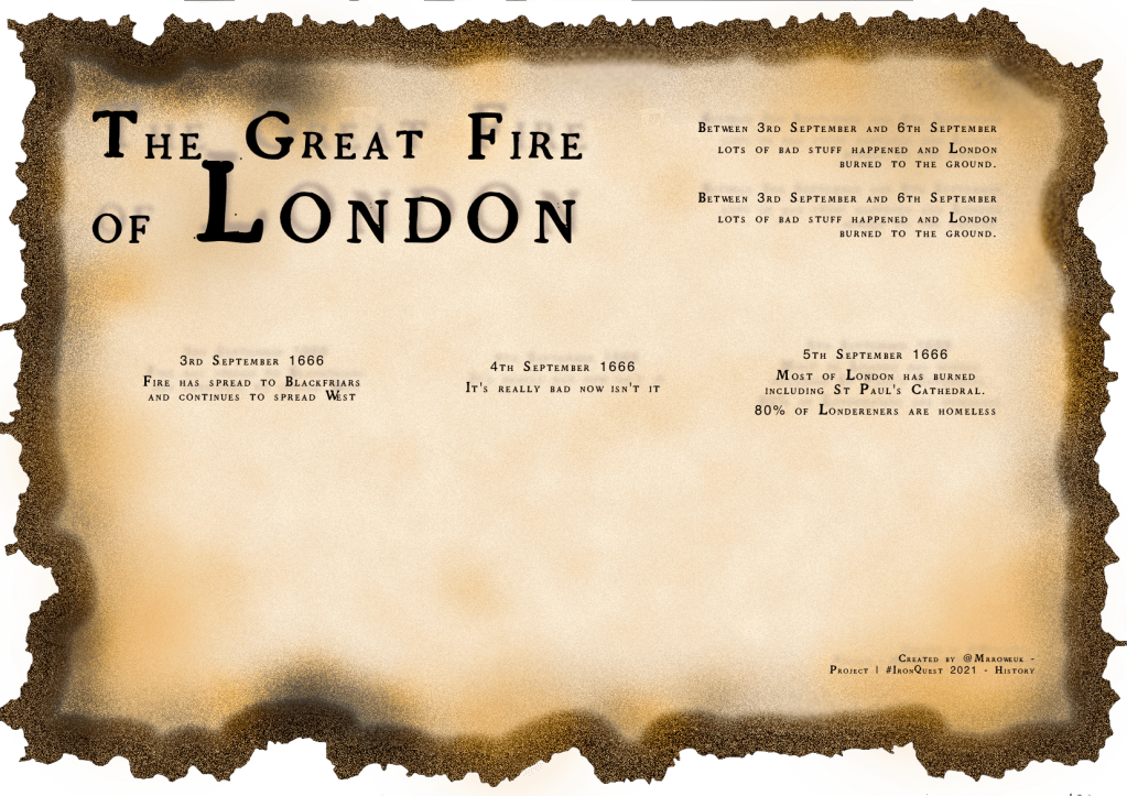
With the subject decided, I quite quickly landed upon a design idea. I wanted to show how the fire spread over the days and also incorporate a timeline, similar to what you might see in a museum. Finally, I wanted to add an old feel to the viz and if possible a burnt look although I thought this might challenge my design skills!
The Background
Most of the backgrounds I do for my vizzes are in Figma but on occasion I need to add a few more effects so I used Pixelmator Pro which is a photo editing software, similar to Photoshop.
I started off with a brownish background which I then added the noise effect to. This gives it the grainy view. The next step was to cut around the edge with a series of random cuts to give the effects of the fire burning the edges.
For the border, I selected the image and brought the selection inside the original image, to create the border. I filled that selection with the brownish/orange colour and again added noise.
The final step was to use the darken effect and a fairly large brush size to go and concentrate on a few areas which had been badly fire damaged as well as randomily darken other areas as well.
With the background done I needed to add the text. As Tableau only renders a few selected fonts anything more bespoke I’ve found works best this way. The font I found was called Grandjean and it was just the look I was after.
After adding the text elements I wanted, a title, a narrative, a prompt for the timeline and the footer and credits I was finished. Here is the final image below.
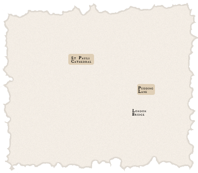
The Maps
There were two main things I wanted to achieve with the maps. 1) Make them look like they were old and 2) allow me to draw the fire and points of interest.
I have done a few maps before in Tableau and so I know that I could use MapBox to do a huge degree of customisation to a map layer which I could then use with my data. For anyone who is new to this or needs a reminder, like I did, then I’d throughly recommend checking out this tutorial from Jonni Walker.
I started in MapBox studio with a Blank style, follow the tutorial above to add the basic layers and then began playing with colours and opacities to get to something that I thought could pass as an old style map.
The other challenge I had was to try and make the map look old I needed to remove some of the newer additions to London, like train stations, main roads and bridges! This was quite easy using layer filtering. The only problem was that by removing buildings and bridges I also lost St Pauls and London Bridge, key landmarks that I wanted to remain as reference points. More on that later….
Bringing a new map layer into Tableau from Mapbox is easy. There is a far better tutorial than my explanation could offer. Here it is.
The final part was to draw the fire (and now key landmarks) onto the map. I did a bit of research and couldn’t find anything online which helped me apart from some images of maps which showed the fire on each day so I had to get manual.
I found a great online resource which allowed me to draw a series of points, creating a polygon, with the points recording the longitude and latitude. Perfect! The website is here.
Rather painstakingly, I drew points for each of the days of the fire, London Bridge, St Pauls and Pudding Lane (where the fire started). This took a lot of trail and error to try and best match up with the online resources but changes the points in the tool was quite easy. I ended with a dataset consisting of
- Day (The day of the fire)
- Type – Fire, St Pauls, London Bridge or Pudding Lane
- Lat
- Long
- Point – Just a iterating ID for each of the types to create the path of the polygon
Then, I dropped [Long] (Columns) and [Lat] (Rows) onto the view. I created a map for each day so dropped [Day] onto Filter and because I wanted to colour the fire and landmarks differently added [Type] to colour. Finally, adding [Point] to path and changing the mark type to Polygon displayed the shapes I had created.
The only additional element was that I wanted to display Pudding Lane as a circle and so using the new Tableau feature Map Layers, I added a second layer for Pudding Lane and hid all the other items using a simple calculated field.
I did the same for each of the three maps.
Timeline
I wanted a timeline to allow viewers to scan through the key points of the fire but without becoming distracting to the impact the maps had. This was quite simple to create. For the data, I had a date and time field and then the narrative I wanted for which I used the excellent website greatfireoflondon.net.
I created a fire symbol which I save to my Tableau shapes repository and then added the [Date] and [Time] to columns as a combined field [Combo]

Then, by adding the [Date], [Time] and [Narrative] elements to the Marks Card was able to create a tooltip.
Map “Filters”
When looking through, I wasn’t happy with a couple of parts of the maps. Firstly, they looked to “clean” and secondly, the landmarks I had coloured differently weren’t labelled and so difficult to understand what they were.
In the end, I created a image overlay for the maps, again in Pixelmator, which used the same techniques as previously for the main images to create a frame, with a bit of noise and also adding the landmark names as well. Placed over the top of the maps as floating images, I was now happy.
I really enjoyed this #IronQuest and while this isn’t the most technical Tableau design I’ve ever done I was pleased to increase my MapBox skills and I was happy with the design of my background.
Thanks for taking the time to read, I hope it was useful.
Simon

One thought on “The Great Fire of London”