
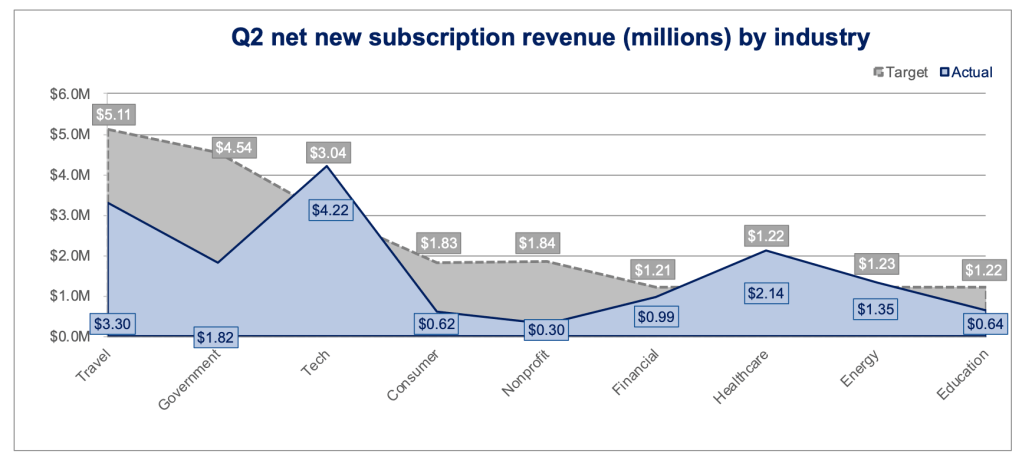
This months challenge was an interesting one and very similar to a popular visualisation community scheme, #MakeoverMonday, where an existing visual is shown with the task to review it and then build something different and hopefully better. Below was the initial chart.
Critique
Whenever giving feedback, I always try and be fair and considered in my responses and give feedback in a way that I wouldn’t mind receiving it. In this case it’s not to any one individual but it’s important to try and bear in mind that someone could well have created this at some point in time.
Starting off with what I liked
- The headline is clear and has the currency denominator mentioned
- The legend is well placed and also clear
- The colours are fine and I quite like the bold line at the top of the blue area
Moving onto what I would consider changing
- I don’t think area charts or lines in general are the best way of comparing distinct categories. In this case Sectors. More often these chart types are reserved for continuous data points, like time. I’m trying to associate Travel with Government, Travel with Consumer, Government with Tech which doesn’t need to be done
- Because the two area overlap each other it’s impossible to see (without the labels) how far above/below the target the respective sectors might be.
- Very rarely I think it’s necessary to label both the points and have an axis. I would choose one depending on the view.
- The sector names being at a 45 degree angle makes it more difficult for the viewer than it should be
- Gridlines – I would consider making the gridlines lighter or potentially removing them completely.
- If the current view were to remain I would sort it differently, potentially by progress vs target or so at least there is a flow of some kind.
(re)create
With that critique in mind, my main goal was to show each of the sectors performance vs target clearly. I also wanted to sort the view in a way that made it easier to view the performance across all the areas and finally use a little colour to easily call out those out or underperforming.
I saw an interesting tutorial from Andy Kriebel on how to create a Candlestick Bar Chart in Tableau. I thought this would be a great starting point. Check out the YouTube video below for the tutorial. Well worth watching
Using the data and applying the methods from the tutorial got me a first view that looked something like this.
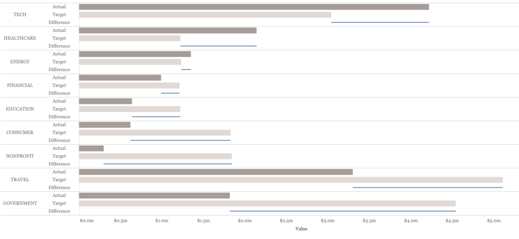
This looked ok. The Sectors were clear now, the comparisons between Actual and Target were easier and the Candlestick provided a little bit of extra context and was also used to sort. The original view used Measure Names in the view to break out into 3 rows per sector, the two bars for Actual and Target and then a Dual Axis to add on the Candlestick element.

However, I wasn’t too happy with the separate bars for Actual and Target. Quite often a bullet chart or Bar-In-Bar is used to show performance vs target. So I decided to create a version that should the Actual vs Target as a Bar-In-Bar.
To begin with, I had to set up the data slightly differently. I now didn’t want to split the view by Measure Names as I wanted Actual and Target on top of each other, not next to each other. The way I achieved this was to union another copy of the data onto the original. This duplicated the data but allowed me to use one copy of the data for the Bar-In-Bar and the other for the Candlestick using the [Table Name] field.
There are a few calculated fields needed to differentiate the two different tables but once I had them I was able to create the view I wanted. Screenshot below of this first stage
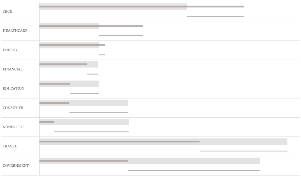
Looking ok, but I now wanted to add some colour, maybe an indicator of some kind and finally some labels for some added context on both the performance and the Candlestick. I prefer labelling directly rather than an axis if it keeps the view clean which I think it does here. Here is the final view.
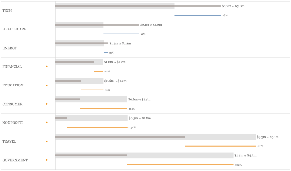
I’m pleased with this version. At a glance it’s easy to see who is performing better and by how much. It’s easy to see who is underperforming with the ‘dot’ (which turns to | in Tableau Public!) indicator and if a little extra detail is needed that is available too.
Finally, the view was added to a dashboard with a title and use of colour to link the headline to the view. Here is the final dashboard (click to see on Tableau Public).

I enjoyed this challenge, it’s a really useful exercise to really look at a viz and see how it might be done differently and then of course, put those thoughts into practice.
Thanks for reading,
Simon
