
Background
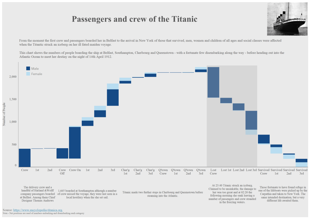
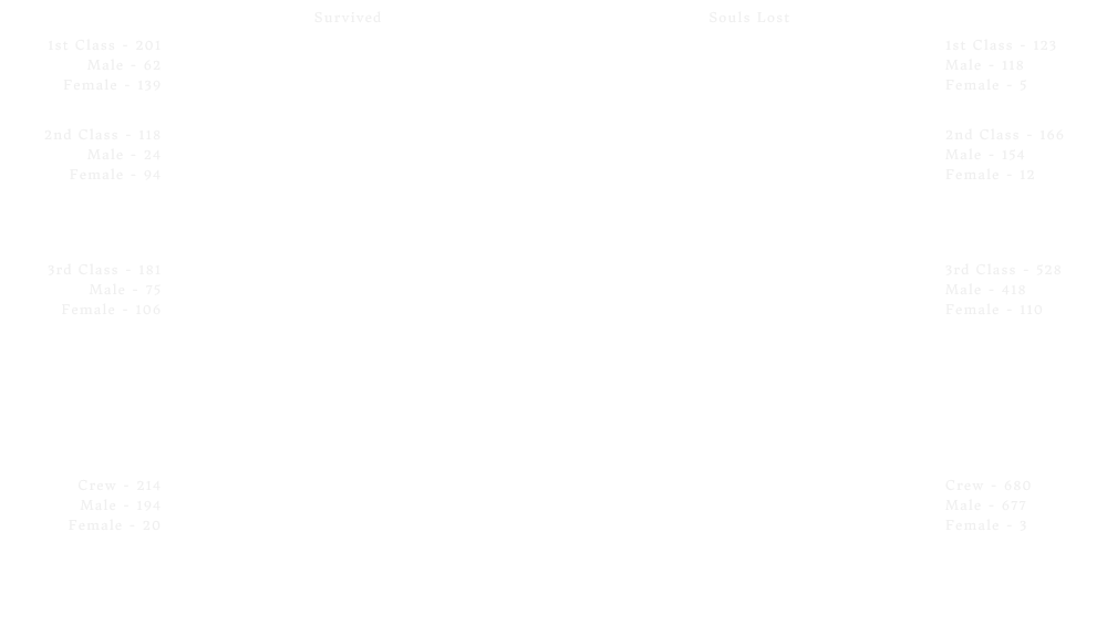
The visualisation was my November submission for the #SWDChallenge – Explain Change. When I saw the briefing for the challenge I made up my mind to look at a previous submission back in 2018. This was a Waterfall chart showing the passenger and crew numbers boarding the titanic with then the decrease representing the tragic end to over 1,400 lives. Here is is below.
Initially I was just going to “redo” this but I quite quickly changed my mind and decided to build something completely new.
After a little research on Pinterest and Google Images I settled on a background that was effectively in two parts, the sky and the water with very subtle gradient shading of the moon (top left) and the darkening of the ocean as it got deeper. Finally, I added a few stars with a very subtle size difference of those closest to the horizon. This was done in Figma. Here is the background image without any additional text or visuals.

With my background complete I wanted to show the journey of how the various demographics (Age, Class/Crew, Gender) broke down before the sinking and then after. I had never used animations before and wanted to build a viz that really showed the movement. My other purpose was to show each individual as a single point. Despite occurring a long time ago, it’s still a sensitive subject and I thought this was the right way.
Data
From the 2018 Waterfall viz, I already had the data I needed for the passengers and crew and so just needed to work out where they would be placed for each of the views.
Essentially, I had one worksheet which I used a X/Y canvas. Each dot would stay on the same worksheet and simply move position when the view changed using a parameter.
I started with my original data and then added a blank column for each column and row combination (X/Y) that I needed. Six different sets in total. They were
- Matrix Row/Column (The overall view)
- Matrix Fate Row/Column (The overall view split by those survived and those that didn’t)
- Class Row/Column (Separate blocks for each of 1st, 2nd 3rd Class and Crew
- Class Fate Row/Column (The above spilt by survived/died)
- Age Row/Column (Distribution of numbers by age)
- Age Fate Row/Column – (Same distribution with those not surviving the tragedy going below a line)
Getting the X/Ys
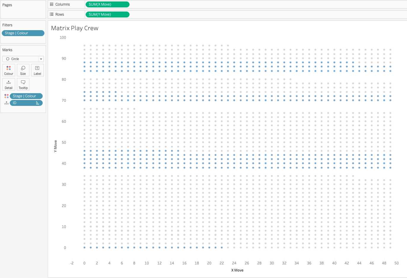
Quite possibly there are better ways of working out all of the X/Y dot placements but I went for a more manual approach. For the initial view I made had a test worksheet in Tableau and plotted each person in a grid form across 50 columns with c2,500 that got me a nice 50×50 grid initially. Something like below
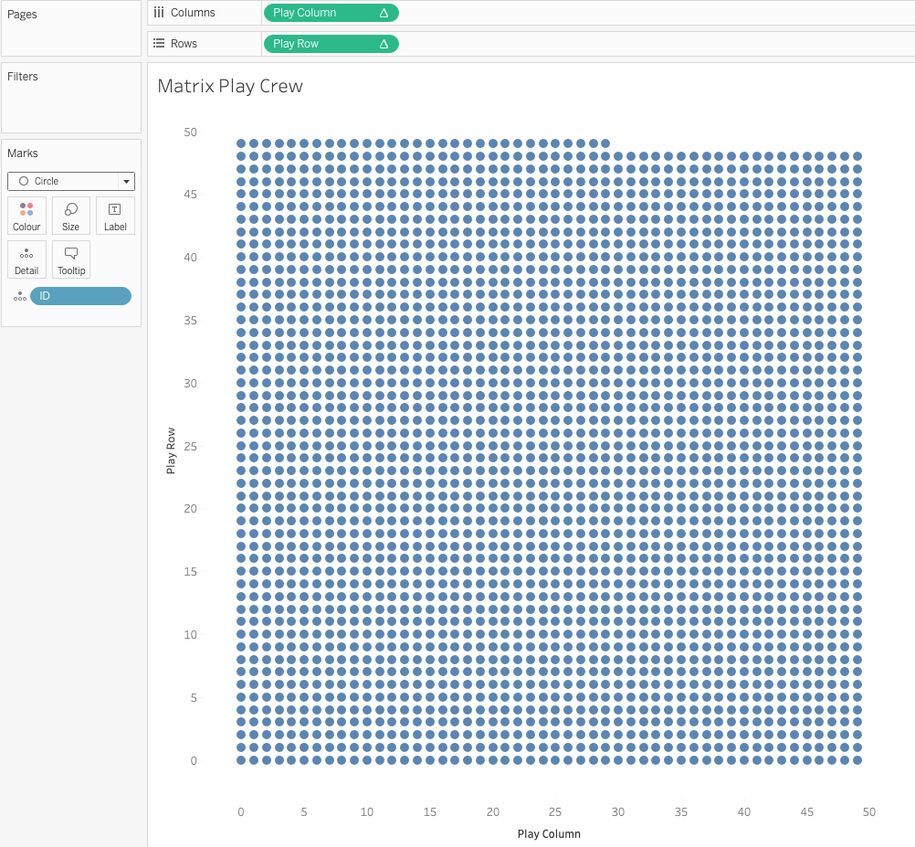
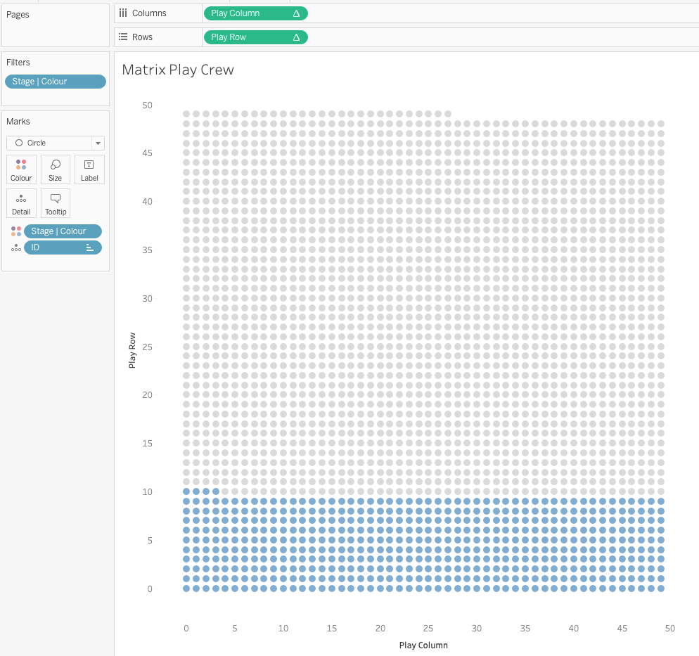
Because I wanted to colour the Men and Women differently I sorted the view based on gender and once I was happy I selected all the points -> View Data and copied the Row / Column information into Excel and simply did a lookup to my master sheet to fill in the respective columns and rows.
For all subsequent views I followed a similar approach, made the test view that I wanted and then exported the row and column numbers to my main data sheet in excel.
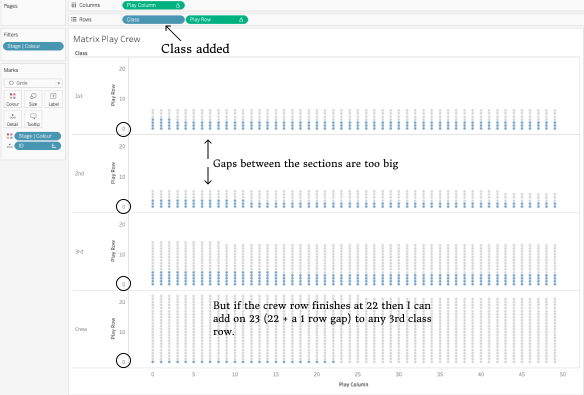
The only tweaks I had to make to this were when I had broken the view down. At this point, in Tableau, each row or column would start again at 0 so after exporting I simply had to add on the number from the previous column/row. For example, when looking at the Class/Crew breakdown, the crew section finished at row 21 so the 3rd class section needed to start at row 23 (one blank row for spacing). Here it is visually with a before and after.
Transitions
At this point I need to call out an amazing viz I recall seeing a while back from animation and general Tableau legend Alexander Varlamov (twitter). I checked it out to make sure I was on the right lines and adapted the main X and Y move calculations. Ultimately, this was a series of IF/ELSE IFs to check the value of the parameter and then based on that, selecting the appropriate Column and Row.
The Titanic Images
This all looked good but I didn’t really have a good start and end point. Beginning and ending with a block of dots didn’t really have the impact I was looking for. For the final shot, I quickly decided on using an image of Titanic underwater and then remembered a blog post I had seen from CJ Mayes hosted by Amar Singh around using an image to make a series of dots with X/Y co-ordinates. I found an image of blueprint image of Titanic that closest resembled what I was looking for and then with a bit of editing/cleanup in Pixelmator it was ready. Check out the amazingly detailed blog post for all the details.
I now had an X/Y for each of the people on Titanic that looked like the Titanic! All the main views were now ready.
Narrative and Annotation
I’ve come to learn that good annotations and narrative really make a good viz so I set about a way which annotations and narratives could update when each transition was made. Initially I tried to use images as shapes but quickly realised this wasn’t going to work as the resolution isn’t good enough.
After a bit of research, I discovered an excellent post by Eric Parker. It was exactly what I was looking for. Now I had a concept I set about making a separate image for the main header texts and an overall annotation image for the views. I made all these in Figma.

Then, I brought them into Tableau using Map -> Background Images ensuring the X/Y were the same as the background image size.
Finally, the key to showing just one image based on the transition is to create a calculated field from the Parameter that moves the view, use that as a detail and in the background image options select the “Only show when” option and select the transition number . This links the specific image to the specific transition number. I did the same with the annotation images. The set up looked something like this.

Dashboard Layout
Building on top of my main Background Image, I added the main text banner sheet, again using the same dimension as the images and background images. For the main body I added the main matrix view, then the annotation layer sheet. One particularly frustrating element was when scrolling “in the wrong place” the axis for my annotations views scrolled in and out. To fix this, I brought a blank sheet on top which worked well and then finally a 0% opacity matrix view (so that the tool tips would work).
The move forward and backwards arrows were separate sheets which had an arrow image assigned to shapes. The move was controlled with a parameter action and a simple calculated field to either move the parameter on or, if it was already at the beginning/end then do nothing.
Wrap Up
I really enjoyed putting this together. Learning more about animations in Tableau was good and I would also encourage anyone interested in them to check out. If you have any comments, feedback or questions please let me know.
Thanks for reading,
Simon
